

Tailwind to the Rescue of Responsiveness
Styling a Profile Card using Tailwind CSS


At some point in a front end developer's journey, one tackles with the nightmare of website responsiveness. During the course of a project, I discovered tailwind CSS to be a fair enough solution to this problem. This is because tailwind CSS is built for mobile devices first and very mobile-friendly.
Tailwind is a utility-first framework designed to speed up the design process by completely removing the need for custom CSS.
In this article, we will be exploring the features of Tailwind CSS . In the past, every HTML element would get a single class and that class would contain a lot of custom CSS in a separate CSS file. Though this is still the general practice, this practice leads to huge CSS files, reduces the ease of maintaining CSS and yields overall poorer developer experience.
For the sake of this article, we would be using tailwind CSS to style a profile card in order to make it responsive.
You should have a basic understanding of HTML and CSS. However I can assure you that this article is really beginner friendly.
Let the coding begins🙂🙂
HTML Design
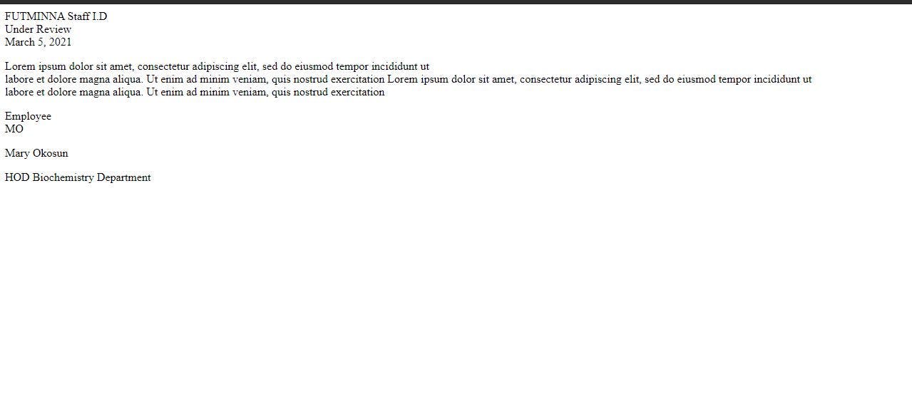
- We would be building a basic HTML page. Below is the code snippet for the Mark-up.
<!DOCTYPE html>
<html lang="en">
<head>
    <meta charset="UTF-8">
    <meta name="viewport" content="width=device-width, initial-scale=1.0">
    <title>Staff Profile Card</title>
</head>
<body>
    <div>
        <div>FUTMINNA Staff I.D</div>
        <div>
            <div>Under Review</div>
            <div>March 5, 2021</div>
        </div>
        <div>
            <div>
                <p> Lorem ipsum dolor sit amet, consectetur adipiscing elit, sed do eiusmod tempor incididunt ut<br>
                    labore et dolore magna aliqua. Ut enim ad minim veniam, quis nostrud exercitation Lorem ipsum dolor sit amet, consectetur adipiscing elit, sed do eiusmod tempor incididunt ut<br>
                    labore et dolore magna aliqua. Ut enim ad minim veniam, quis nostrud exercitation
                </p>
            </div>
        </div>
        <div>
            <div>Employee</div>
            <div>
                <div>MO</div>
                <div>
                    <p>Mary Okosun</p>
                    <p>HOD Biochemistry Department</p>
                </div>
            </div>
        </div>
    </div>
</body>
</html>
- This is the how it looks when viewed on a browser. Pretty blank right!! We would be going into the stylings right away.
- Styling the head tag by adding the CDN for tailwind css. This installs tailwind CSS as a PostCSS plugin
<head>
    <meta charset="UTF-8">
    <meta name="viewport" content="width=device-width, initial-scale=1.0">
    <link href="https://unpkg.com/tailwindcss@^2/dist/tailwind.min.css" rel="stylesheet">
    <title>Staff Profile Card</title>
</head>
STYLING
Styling the body tag
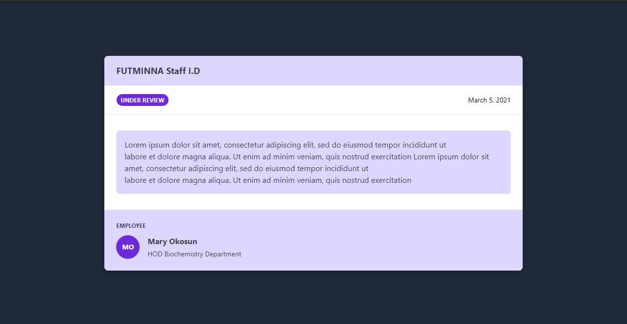
<body class="bg-gray-800 flex justify-center items-center h-screen ">
  <div class="w-2/3 h-2/3 flex flex-col break-word bg-white shadow-lg rounded-lg overflow-hidden ">
      </div>
</body>
Elements are styled by using the class attributes of each elements. bg-gray-800 sets the background colour of the body to a dark shade of gray. Note that there are 9 different shades of various colours. These include color-100, color-200...up to color-900. These applies to all colours with the exception of white and black. We set the display to flex and justify-content and align-items to center so the children divs can be centred. h-screen indicates setting the height of the body to be same as that of the screen.
Styling the first div of the parent div
<div class="text-gray-700 bg-purple-200 font-bold text-lg px-6 py-4 mb-0">FUTMINNA Staff I.D</div>
      <div class="w-full px-6 py-4 flex justify-between items-center border-t border-gray-200">
          <div class="bg-purple-700 text-xs uppercase px-2 py-1 rounded-full
           border border-gray-200 text-gray-100 font-bold">Under Review</div>
          <div class="text-sm">March 5, 2021</div>
      </div>
Set the text color to a 700 shade of gray and a bold font. The text size to a large size. px-6 indicates padding on the x-axis i.e padding top and padding bottom. Note that 4px is equal to size 1 in tailwind CSS so therefore px-6 means padding top and bottom is 24px. py-4 indicates padding left and right is 16px. mb-0 indicates margin-bottom sets to 0px. w-full sets the width of the divs to fill the container. text-sm sets the text size to a small size.
Styling the second div of the parent div
<div class="w-full px-6 py-8 justify-between border-t border-gray-200">
          <div class="flex-1">
              <p class="border text-gray-700 rounded-lg p-4 bg-purple-200"> Lorem ipsum dolor sit amet, consectetur adipiscing elit, sed do eiusmod tempor incididunt ut<br>
                  labore et dolore magna aliqua. Ut enim ad minim veniam, quis nostrud exercitation Lorem ipsum dolor sit amet, consectetur adipiscing elit, sed do eiusmod tempor incididunt ut<br>
                  labore et dolore magna aliqua. Ut enim ad minim veniam, quis nostrud exercitation</p>
          </div>
      </div>
Styling the third div of the parent div
<div class="rounded-b px-6 py-6 bg-purple-200">
            <div class="uppercase text-xs text-gray-700 font-bold">Employee</div>
            <div class="flex item-center pt-3">
                <div class="bg-purple-700 w-12 h-12 rounded-full uppercase font-bold flex items-center
                justify-center text-sm text-white">AH</div>
                <div class="ml-4">
                    <p class="font-bold text-gray-700">Abubakar Hammed</p>
                    <p class="text-sm text-gray-700 mt-1">HOD Physics Department</p>
                </div>
            </div>
        </div>
We set the div class to a rounded border and padding-left and right to 24px with a light shade of purple background. mt-1 sets the margin-top of the paragraph to 4px
Your final code snippets should be similar to the below
<!DOCTYPE html>
<html lang="en">
<head>
    <meta charset="UTF-8">
    <meta name="viewport" content="width=device-width, initial-scale=1.0">
    <link href="https://unpkg.com/tailwindcss@^2/dist/tailwind.min.css" rel="stylesheet">
    <title>Staff Profile Card</title>
</head>
<body class="bg-gray-800 flex justify-center items-center h-screen ">
    <div class="w-2/3 h-2/3 flex flex-col break-word bg-white shadow-lg rounded-lg overflow-hidden ">
        <div class="text-gray-700 bg-purple-200 font-bold text-lg px-6 py-4 mb-0">FUTMINNA Staff I.D</div>
        <div class="w-full px-6 py-4 flex justify-between items-center border-t border-gray-200">
            <div class="bg-purple-700 text-xs uppercase px-2 py-1 rounded-full
             border border-gray-200 text-gray-100 font-bold">Under Review</div>
            <div class="text-sm">March 5, 2021</div>
        </div>
        <div class="w-full px-6 py-8 justfy-between border-t border-gray-200">
            <div class="flex-1">
                <p class="border text-gray-700 rounded-lg p-4 bg-purple-200"> Lorem ipsum dolor sit amet, consectetur adipiscing elit, sed do eiusmod tempor incididunt ut<br>
                    labore et dolore magna aliqua. Ut enim ad minim veniam, quis nostrud exercitation Lorem ipsum dolor sit amet, consectetur adipiscing elit, sed do eiusmod tempor incididunt ut<br>
                    labore et dolore magna aliqua. Ut enim ad minim veniam, quis nostrud exercitation</p>
            </div>
        </div>
        <div class="rounded-b px-6 py-6 bg-purple-200">
            <div class="uppercase text-xs text-gray-700 font-bold">Employee</div>
            <div class="flex item-center pt-3">
                <div class="bg-purple-700 w-12 h-12 rounded-full uppercase font-bold flex items-center
                justify-center text-sm text-white">AH</div>
                <div class="ml-4">
                    <p class="font-bold text-gray-700">Abubakar Hammed</p>
                    <p class="text-sm text-gray-700 mt-1">HOD Physics Department</p>
                </div>
            </div>
        </div>
    </div>
</body>
</html>
The profile card should be displayed as such. Resizing doesn't affect the layout of the page. The layout remains the same for smaller screen sizes and larger screen sizes.
RESOURCES
Some resources that I found to be very helpful in understanding tailwind CSS better includes but not restricted to the following
Please feel free to drop your comments, questions and feedbacks.
Happy coding ✨✨✨